

Threading the Needle:
Designing Woven’s Standout Brand Identity

Introduction to Woven & Its Mission:
New York City: the land of hustle, heart, and high fashion. But what happens to last season’s hottest styles when the next trend comes barreling through? Enter Woven, a sustainable fashion brand on a mission to cut down on clothing waste by giving outdated, off-season garments a second life. The brainchild of Candace, Woven takes perfectly good fashion cast-offs from companies and resells them at market price—because looking good and being sustainable should go hand in hand.
Woven’s audience? Millennials and Gen-Z trendsetters who want their style to be as eco-conscious as it is eye-catching. But with social media driving brand awareness, Woven needed more than just a mission—they needed a look that turned heads. A brand identity that wasn’t just stylish but memorable, flexible across digital and physical platforms, and distinct from the sea of resale competitors. That’s where we came in.

Why Woven Needed a Rebrand:
Candace had a vision and a business model that made total sense. But when it came to the visual branding, something wasn’t clicking. She already had a logo—kind of. It attempted to capture the essence of Woven but wasn’t quite hitting the mark. She needed a fresh take: a logo and identity system that spoke to her audience, worked seamlessly across social media, and gave her web designer a solid foundation to build Woven’s digital home.
With Instagram as Woven’s main stage, standing out wasn’t just a preference—it was a necessity. The brand needed a strong, cohesive visual identity that could tie everything together, from profile pictures to packaging. That’s when Candace reached out to us, and we eagerly rolled up our sleeves.
How We Developed the Brand Identity:
We kicked things off by diving deep into Candace’s vision and Woven’s mission. What did sustainability look like in design? How could we weave the brand’s essence (pun absolutely intended) into every element? Sorting through our meeting notes, one theme kept surfacing: connection. Connection between past and present fashion, connection between brands and consumers, and connection between sustainability and style. And what better way to represent connection than through the letter W itself?
The original logo idea was there, but it needed refinement. We hit the sketchbooks first, exploring ways to create a woven-inspired letter mark that felt modern and seamless. After sketching a variety of concepts, we transitioned into Adobe Illustrator, digitizing the strongest contenders. Once we had a solid selection, we presented Candace with the best options. She picked the one that spoke to her most, and from there, we refined it until it was just right. With the logo locked in, we expanded the identity system—creating complementary badges, patterns, and a color palette to make Woven pop.

What We Created:


The final logo? A solid stroke letter mark forming the letter “W,” with a stroke that loops through the middle, weaving itself back through the negative space—a perfect nod to the company’s name and mission. Simple, striking, and most importantly, versatile. We designed it to pair seamlessly with a typeface that would carry across all branding efforts, ensuring a consistent and recognizable look.
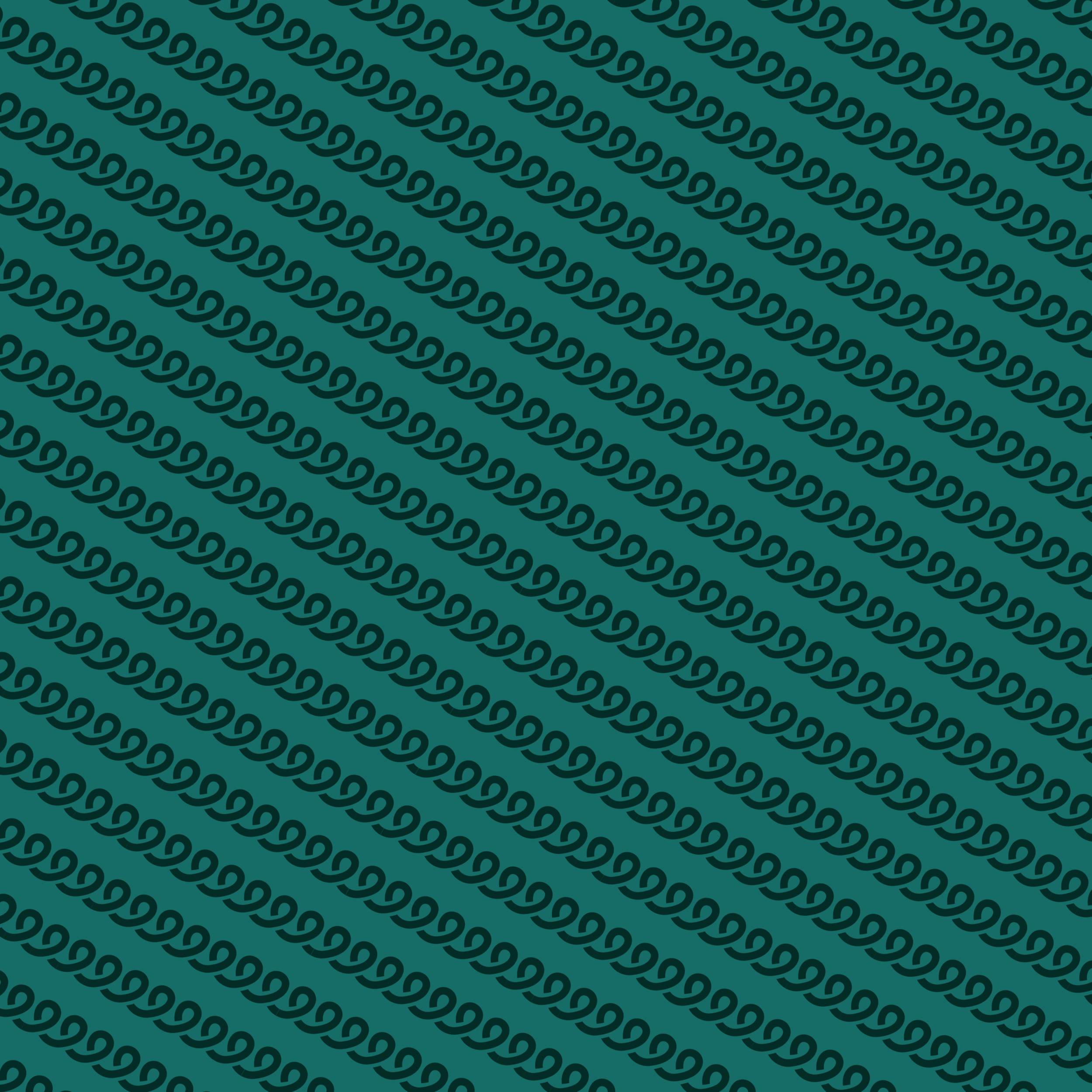
To strengthen Woven’s visual identity, we curated a bold, cool-toned color palette. These colors weren’t just aesthetically pleasing—they reinforced Woven’s commitment to sustainability, leaving a lasting impression in consumers’ minds. And because no brand identity is complete without personality, we developed a woven spiral pattern that echoes the fluidity of the letter mark. This pattern serves as a fun, youthful element, strategically designed to attract Woven’s younger demographic and stand out in promotional materials. Finally, we created a series of badges, perfect for use across social media, packaging, and even stickers—because who doesn’t love a good sticker?

Results & Benefits of the Rebrand:
With a fresh identity system in place, Woven’s brand presence took on new life. The updated visuals seamlessly integrated across their social media, website, and marketing materials, making everything feel cohesive and polished. No more patchwork branding—Woven now had a consistent, recognizable identity that instantly resonated with its audience.
Most importantly, the identity system wasn’t just beautiful—it was functional. Whether applied to a website header, a social media post, or a sticker on a package, the branding worked flawlessly. Candace now had a strong foundation to build on, giving Woven the visual identity it deserved. And just like that, a brand was woven together—seamlessly, stylishly, and sustainably.