Ian Dunlap
A Master Brand for The Master Investor
The Man,
The Myth,
The Master Investor
Ian Dunlap isn’t just playing the stock market; he’s mastering it. As one of the most dominant voices in the financial space, Ian has built a reputation for giving out clear, no-nonsense investing advice to people looking to get a foothold in the market. Whether through his YouTube show Market Mondays or his stock club Red Panda, he’s on a mission to empower people to take charge of their financial futures.
But here’s the thing—being a financial expert and being a *brand* are two different ball games. Ian had the knowledge, the credibility, and the audience, but he needed something more. He needed a visual identity that hit just as hard as his insights. Something unmistakably him—so that when people saw it, they knew exactly who they were dealing with. That’s where we came in.

The Mark of a Master:
Ian’s influence was growing, and with it, so was his visibility. He was landing more media spots, speaking at major events, and becoming a bigger presence across social platforms. The problem? He didn’t have a signature mark—something he could stamp onto his content that screamed The Master Investor without needing an introduction. He needed a brand identity that could stand alone, that could be instantly recognizable without any explanation.
That’s when he called Don John Designs. His ask? A logo and identity system that captured his brand’s power, authority, and simplicity. It needed to be minimal, impactful, and effortlessly iconic—something that could be splashed across social media, merchandise, and event stages with undeniable presence. In short, he wanted a mark as strong as his message. We were up for the challenge.
From Market Analysis to Masterpiece:
The first step? Research. We dug into the branding landscape of financial educators, investment gurus, and major firms. What did we find? A sea of wordmarks—logos that were just names in fancy fonts. No symbols. No striking visuals. Just text. That was our first major insight: Ian had an opportunity to break from the pack and *own* a symbol that represented his expertise.
With this in mind, we started sketching. Ian wanted something sleek, something timeless. Black and white, no fluff. We explored different ways to incorporate his brand name into a mark, testing variations of monograms and abstract icons. After refining multiple concepts, one idea stood out: a monogram that seamlessly combined the letters “M” and “I.” The negative space in the “M” subtly revealed an “I,” creating a sharp, balanced mark that felt both sophisticated and strong. A perfect match for The Master Investor.
A Mark of Distinction:
The final product? A monogram logo that captured everything Ian stands for. Set in a bold serif style, the mark cleverly integrated his initials, symbolizing precision, expertise, and authority. The negative space trick in the “M” wasn’t just a cool design choice—it was a nod to the way Ian sees opportunities in the market that others miss.
Beyond the logo, we built out a cohesive identity system. We designed circular badge variations for added branding flexibility, selected a refined black-and-white palette for a clean, high-contrast aesthetic, and paired the monogram with a modern sans-serif typeface for versatility. Whether on Instagram, YouTube thumbnails, or merchandise, this identity was built to make an impact anywhere it appeared.


Brand Awareness Unlocked:
Ian’s reaction? Pure excitement. The final design wasn’t just a logo—it was a confidence booster, a signature, a statement. It gave him a brand identity as sharp as his insights, something that could live across every platform he touched and be instantly recognized.
Since rolling out the new branding, Ian has been able to stamp his mark on everything from social posts to event banners, making his presence more unmistakable than ever. His audience now instinctively connects the logo with his voice, strengthening his authority and cementing his status as The Master Investor.
With a brand identity as solid as his stock picks, Ian Dunlap is now positioned to make an even bigger impact in the financial world—and we’re proud to have been part of that journey
Ian Dunlap
“I love what you created.”
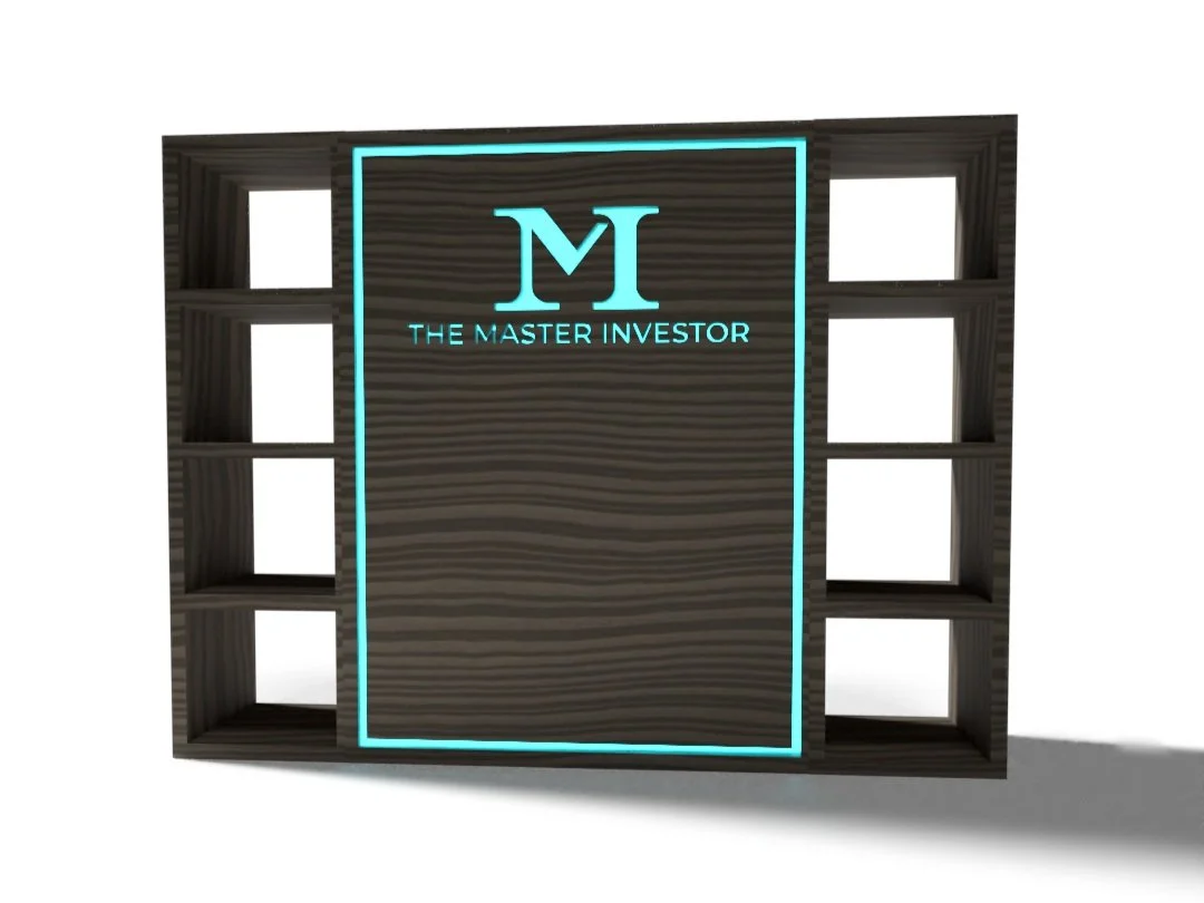
But Wait There’s More:

Ian was so happy with the work we did for his brand he later asked us to help design a backdrop installation for for when he does podcast in a studio. The idea he had in mind was something simple that drew the eye to the center and quickly established who’s content the viewer was watching. We did a few 2D concepts before we moved into Adobe Dimension to create a 3D model of what we came up with to so Ian could get a better idea of what the backdrop would look like before it went to the vendor to be made.