Walking the Talk:
Vector Portraits That Make an Impact
Introduction to Walkie Talkie and the Project:
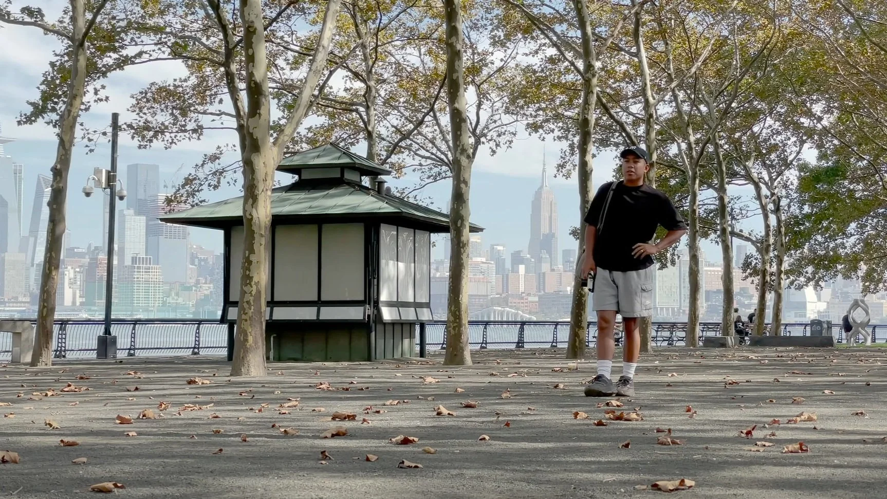
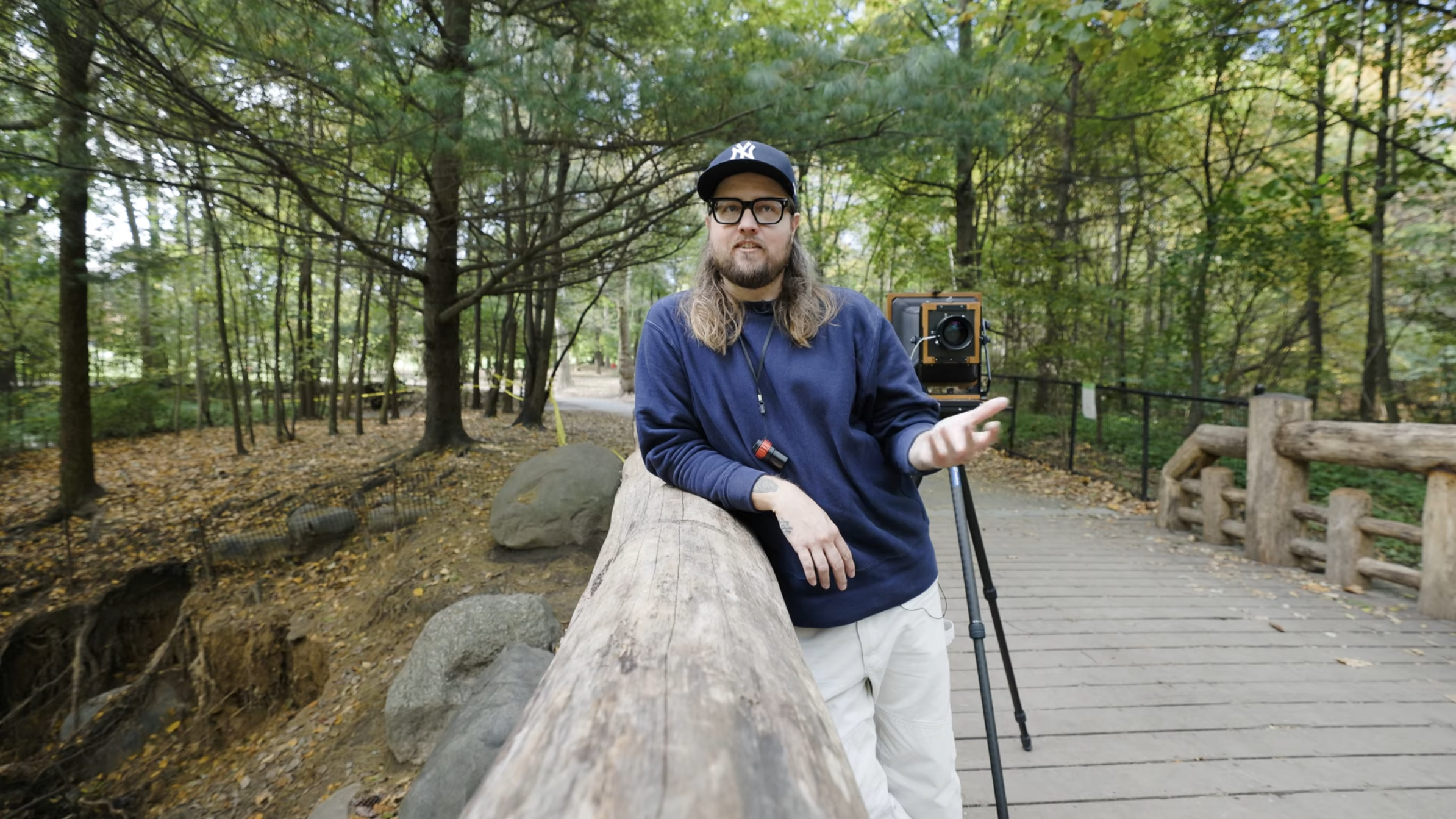
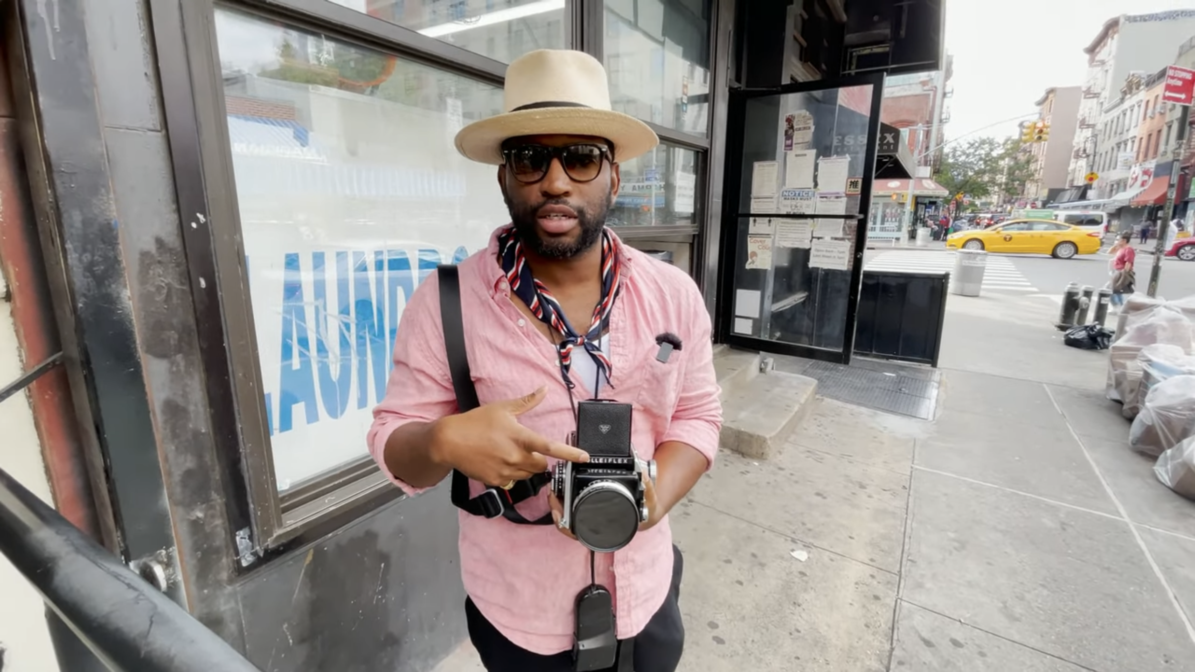
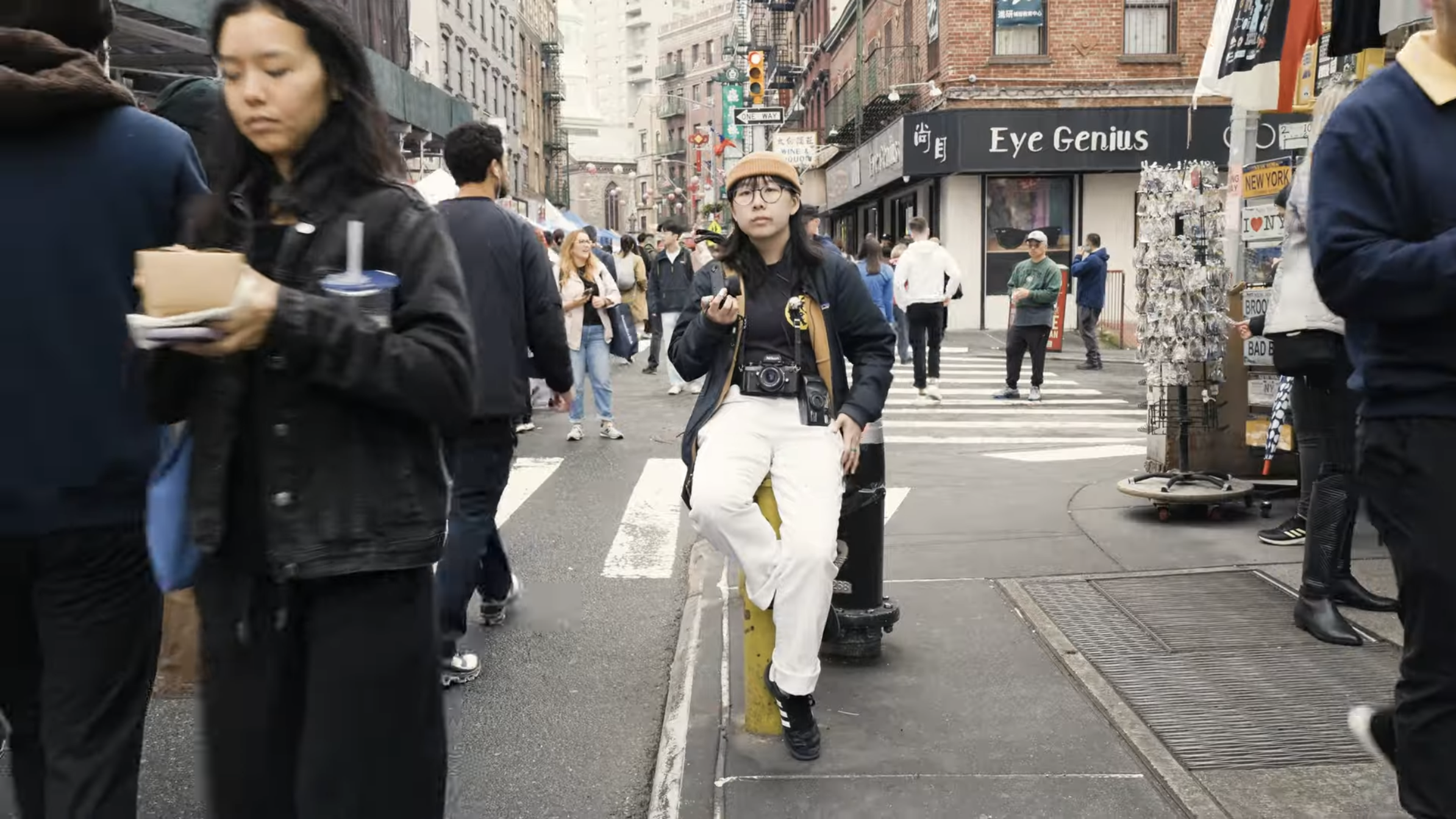
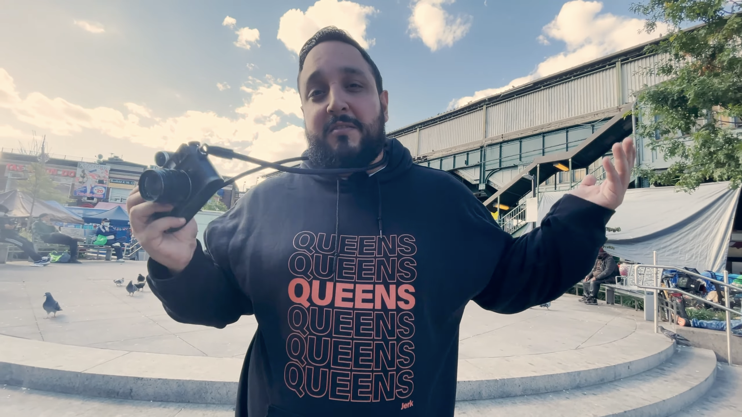
Paulie B is a name synonymous with raw, creative energy in the photography world. His YouTube series Walkie Talkie has grown a loyal following among photographers, creatives, and anyone with an appreciation for the craft of capturing moments. Each episode features a different photographer, shedding light on their journey, their work, and the hustle it takes to succeed. The series is not just a day in the life talk show—it’s a celebration of street photography, its culture, history, and the stories behind the lens. What’s even cooler? The series has its roots firmly planted in New York, a city known for its gritty street photography, constant motion, creative energy, and characters.
Each episode is a window into the world of these featured photographers, but I noticed one thing missing: a little visual flair to make the photographers stand out even more in the videos promotion. Sure, Paulie had the vision and the voice, but I thought it would be fun to give the photographers of the episodes an extra pop. After all, what’s better than a cool illustration to complement the guest telling their story? That’s where I stepped in.
Why We Took
on the Project:


Paulie’s channel had become a spotlight for the photography community and he wanted to use its success to expand and highlight photographers in other cities, but going forward the episodes needed something visual to enhance the series. While the thumbnails were already solid, we saw an opportunity to add even more character and personality to the series. Paulie and the featured photographers didn’t need a full branding overhaul—they just needed a way to shine individually and collectively. That’s where we saw our chance to help. We knew that by creating some fun, unique, and recognizable vector illustrations, we could give the series an eye-catching, signature style while promoting both the photographers and Paulie’s series. And, let’s be honest, who wouldn’t want to see their face turned into a vibrant, bold vector portrait?
How We Created the Illustrations & Logo:

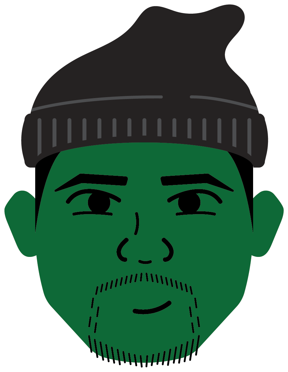
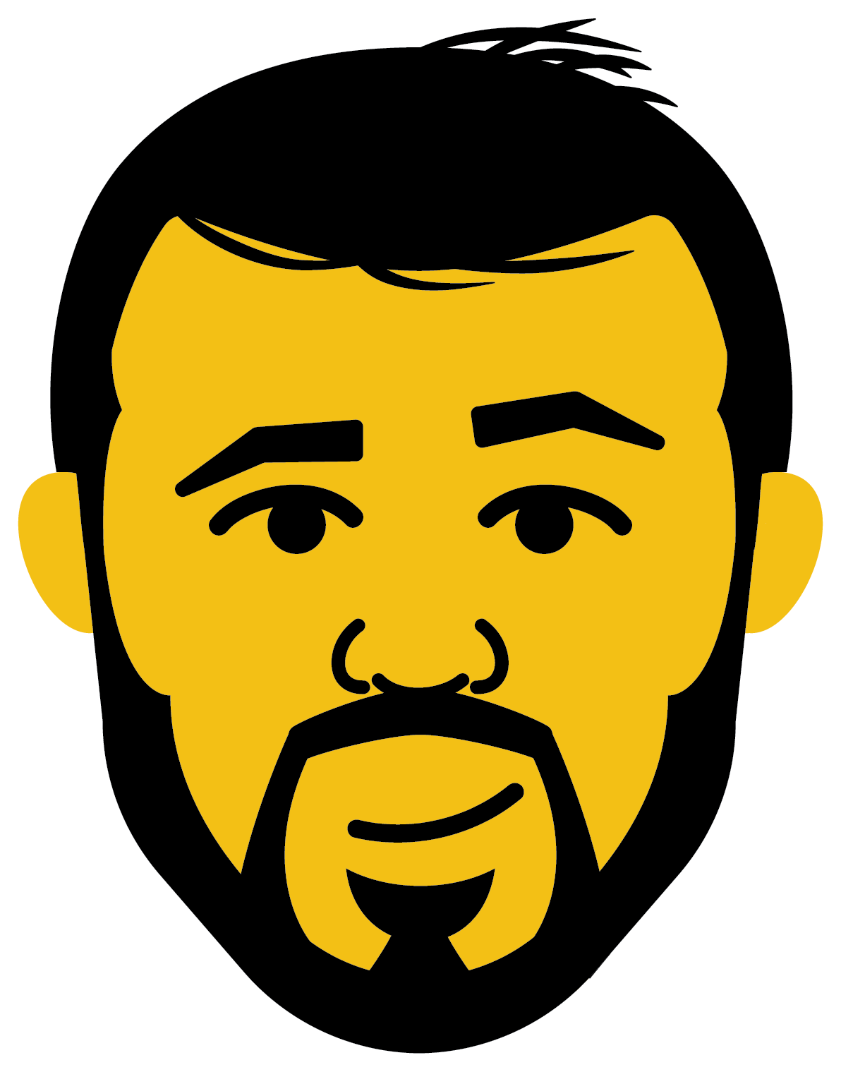
My process was all about simplicity and soul. First, I would sit down with an episode of Walkie Talkie, paying close attention to the personality and energy of the featured photographer. I didn’t just want to make any old portrait—we wanted to distill the essence of the person and convey it in a way that felt true to the series’ vibe. After watching the episode, I’d grab a small notebook, and without overthinking it, sketch a rough 1.5x2 drawing of the photographer. Keeping it small helped me focus on just the essential details, and if it looked good in that little space, I knew it would scale up just fine.
Once I had the rough sketch, it was time to bring it to life in Adobe Illustrator. Using the primary color from the video’s thumbnail, I’d fill in the faces and create a pop of color to bring each character to life. Solid black for hair, clean lines for facial features, and, sometimes, even a little hat to make each portrait even more personal. The result was a series of vector portraits that were fun, recognizable, and vibrant—just like the photographers themselves.
But it wasn’t just the illustrations we were working on. We also designed a logo for the Walkie Talkie series. Drawing inspiration from graffiti culture—specifically the hand-drawn, flat-head marker style often seen on New York’s streets—I created a logotype that embodied the spirit of the city. It was bold, urban, and full of personality. After sketching a few concepts and refining my favorite, I brought it into Illustrator to complete the digital version.


The Final Designs & Their Use:
The outcome of this project was a series of bold, eye-catching vector portraits and a logo that was just as raw and authentic as the city it was inspired by. The portraits were designed to be fun yet simple, with clean lines, a burst of color from the thumbnails, and subtle details that made each photographer pop. Whether it was the distinct hairstyle or the unique expression, each illustration captured the photographer’s essence while keeping the tone light and playful.
The Walkie Talkie logo was just as compelling—its graffiti-style lettering paid homage to New York’s vibrant street art scene, while also giving the series a cool, rebellious flair. It was a perfect visual anchor for the show, and every time it appeared, it felt like a nod to the city’s influence on Paulie’s work and the photographers he featured. This logo would be something easily recognizable, something that could be stamped on any piece of content related to the series.


How It Benefited Walkie Talkie & Paulie B:
The impact of this project was immediate and tangible. Paulie and some of the featured photographers began sharing the illustrations across their Instagram stories, giving the portraits—and the series—additional visibility. Not only did it help promote the series and the featured photographer’s work, but it also created a buzz around the project.
The photographers themselves were thrilled with the illustrations, often sharing them on their personal accounts, allowing us to reach even more followers and photography enthusiasts. The vector portraits became a fun way to highlight the featured photographers and promote the Walkie Talkie episodes in a way that felt organic, shareable, and connected to the personality of the series.
In the end, my illustrations and logo did exactly what I hoped: they made the Walkie Talkie series feel more unique and personal while giving flowers to the voices and personalities of the photographers featured. And best of all, it was a blast to do.